This month, Google will start requiring you to adopt the new interface.
This month marks the beginning of Gmail’s permanent switchover, which will switch everyone to a new integrated look.
We’ll all simply have to get used to the bouncy — and very blue — design since Google revealed it is getting away of the option to return to the old Gmail UI in a blog post on Tuesday. That includes the Google Sans Text font used in Material Design 3.
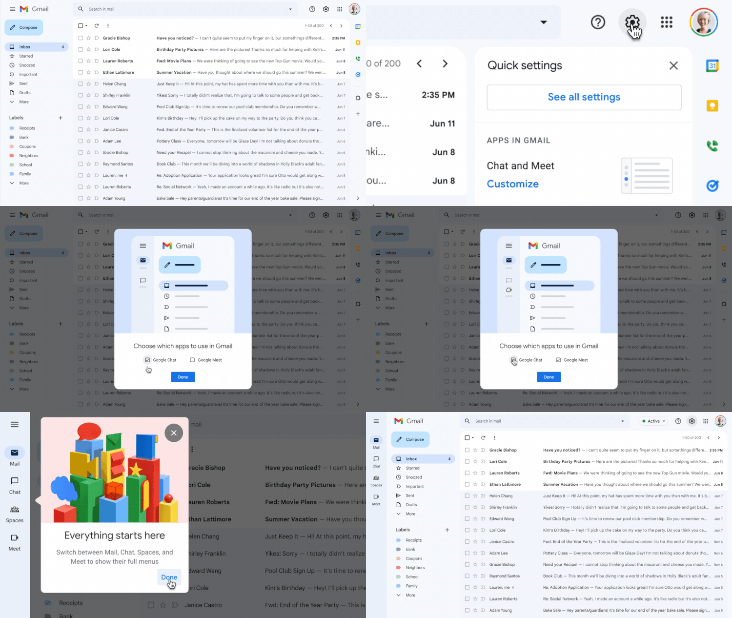
The new Gmail design, which has options for Mail, Chat, Spaces, and Meet in the far-left sidebar, is referred to by Google as the “integrated” view. When you click on these buttons, the program takes up the entire screen rather than only appearing as a small pop-out menu when you hover over them.
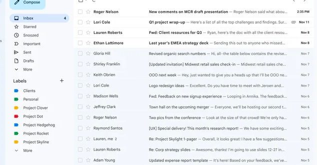
You can disable Meet and Chat from your Settings menu if the extra buttons bother you. This prevents you from seeing the additional sidebar and instead gives you a screen tailored specifically for Gmail.

Since February, when Google first began testing this style, it has been nagging people to choose it. In July, the new design became opt-out (which means it swapped you over by default). As with some of the other updates it has already made to its other Workspace apps, such as Docs, Calendar, and Sheets, Google is now prepared to make this shift permanent.
I’ve been using the new style for a while now, and I honestly don’t see myself switching back to it. It took some getting used to, but it’s much more contemporary, and if I disable the settings for the additional applications, it just feels like the old Gmail.
 Tech Gadget Central Latest Tech News and Reviews


