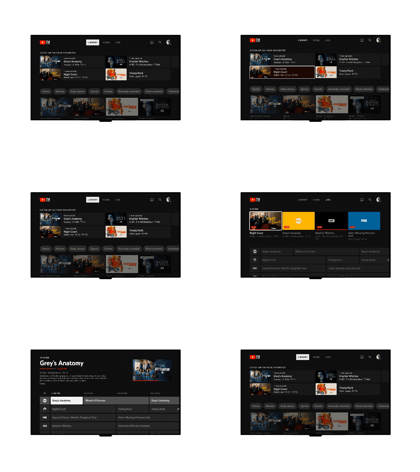
Today, YouTube TV made the announcement that it would be updating both its Live Guide and Library. Some users have already received the updated Live Guide, which offers a more conventional grid showing what is currently airing and what is coming up. It features a new design and suggestions for what to watch. Over the next few months, updates to the Library will start to roll out starting today.
The new Live Guide has been updated with a row of hand-picked suggestions at the top, a compacted grid that shows more channels and programming on the screen, and a cleaner overall look. The new guide also provides users with more details about each live performance or film.
In order for viewers to scroll less and absorb information more quickly, a condensed grid was created. Today’s blog post was written by Esther Ahn, Head of Design for YouTube TV and Primetime Channels.
Ahn further asserts that since there are fewer steps in the new guide, recording content from it is simpler. According to the post, the Live Guide makes it clearer to users whether or not a program or movie has already been recorded to the DVR.
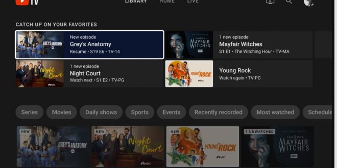
Thanks to enhanced filters and organizational tools, the updated Library has improved how users can manage their content. The side navigation has been removed from YouTube TV, and its place has been taken by a row of filters for more specialized content categories, like daily shows. Additionally, a brand-new “Catch up on your favorites” shelf makes it simple for users to locate the content they value the most.
Ahn observed that users who had big libraries complained about how challenging it was to locate a movie they wanted to watch. The programs that members were interested in several years ago may no longer be relevant to them, according to Ahn, who noted that over time, members built up their libraries. Because they lacked the tools to organize their shows, movies, and sports, as their libraries grew, they became less and less useful.

Since the Live Guide and Library are the sections that YouTube TV viewers use the most, the company wanted to concentrate on improving them. YouTube created new side panels with shortcuts like “Add to Library” for both features. Additionally, a “Set Reminder” shortcut is being developed.
With these adjustments, YouTube users will have more control over their content exploration and discovery.
When you turn on your TV and there are more apps and channels than ever before, decision fatigue is real. Whether it’s joining a live game or seeing what’s popular right now, viewers want simpler ways to find the content that’s most relevant to them, Ahn wrote.
Despite the fact that overall these are only minor design adjustments, making the product easier to use gives YouTube TV a competitive edge over its rivals, such as Hulu with Live TV or Sling TV.
The company promised more updates in the future, including ones that would improve user profile switching, live playback flexibility, and interactivity. However, they did not provide a launch date for these features.
 Tech Gadget Central Latest Tech News and Reviews


