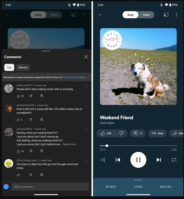
YouTube Music recently redesigned its “Now Playing” screen, adding a comments section where users can read and write comments from the app. The latest update adds larger cover art, accessible buttons, and more.
A company spokesperson said iOS and Android devices will get the redesign today.
YouTube Music added a comments button that displays official music video comments, as 9to5Google reported. The app becomes more social when users type their own.
Under the cover art is the comment button. A panel slides up when the button is pressed.

Next to the comments are like/dislike, save, share, download, and radio icons, previously hidden until users tapped the album cover. Moving the song title buttons makes them easier to access.
Another minor change is that the song/video toggle is now white instead of matching the background.
The redesign follows the launch of YouTube Music’s new TikTok-style short-form personalized video feed, “Samples,” which features official music videos and live footage.
 Tech Gadget Central Latest Tech News and Reviews


