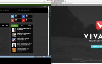
A new browser is in town, and it’s name is quite familiar: Vivaldi. Although the browser takes inspiration from famous composer Antonio Vivaldi and it actually makes The Four Seasons play in my mind when opening up the new browser, it doesn’t have much else in common with the virtuoso. Well, if we’re to be honest, it might just end up being an innovative of its time, but that can’t be said just yet. The Vivaldi browser aims to take on the giants that have dominated the web browser industry for the past few years, namely Google Chrome, Safari, Opera and Mozilla Firefox. Each of these browsers have their issues and quirks, but none of the are made for the power-user, as Ars Technica points out.
The Vivaldi browser surprised me when I first opened it up and I honestly thought: well, this is going to be a bust, as it took a while for the first time. But the subsequent few times, Vivaldi started up and loaded the tabs I had open in the previous session in a jiffy, noticeably faster than Google Chrome. Google Chrome is my go-to browser and I have been using it for years now, but for the past few months, I’ve been having major issues with the browser. It is slowing down my laptop, it is using far too much memory, and it constantly freezes over when I try downloading or uploading picture files (PNG, JPG, JPEG, etc). It got to the point where I was switching between Mozilla Firefox and Chrome when working with images, which was a strain on my laptop and on my brain. Vivaldi came as a surprising new find, and so far, I’m pretty impressed.
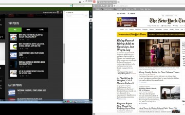
Vivaldi is a simple browser that targets those who spend a lot of time using the internet, not just for Facebook, but for business purposes, editing, writing, publishing and such. When you have multiple windows open, a browser shouldn’t afford being slow, laggy and unresponsive and Vivaldi lives up to expectations. I’m a power user, and I use a dual-monitor setup and multiple windows with various open tabs, necessary for my work and editing purposes. Compared to Chrome, Vivaldi handles the strain extremely well and transitioning from window window and tab to tab couldn’t be smoother.
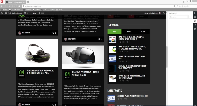
Although still just the second technical preview, the Vivaldi browser is rather comprehensive and will definitely leave people impressed with its speed and customizability. Being a technical preview, it’s not a finished product, so there should be improvements made to the UI and the behavior of the software. At the moment, it functions a lot like Google Chrome, which is probably why I like it so much. You can make the taskbar and bookmarks bar transparent, so that it will be the same color as the website your are currently browsing, which is a neat step towards a clean, easy to use browser. All of this should be customizable, in my opinion, but since the team behind the Vivaldi browser is still hard at work and reading user feedback constantly, I’m sure they will make these superficial things customizable. Once you install the browser, you will be able to import your bookmarks from Opera, Internet Explorer and Mozilla Firefox, or from HTML export files, which I did with Chrome. It’s remarkably easy and works pretty fast.
The bookmarks were very important to be, so I’ll start with that. Once I had my bookmarks imported and opened up the Bookmarks panel in Vivaldi, I found myself confused. I saw before me a set of folders labeled with generic categories like Technology, Sports, Music, Movies, News, Local, Games, etc and I couldn’t find anything in them. Initially, I though: Wow, Vivaldi is so smart that it grouped my bookmarks! That would have been over the top, but that’s not what Vivaldi did. In fact, the browser moved all of my bookmarks into the imported folder and kept all my previous folders and order the same and I just had to move them to the top bookmarks bar, where I like to keep them usually. You can customize that and put your bookmarks bar or the quick access panel on whatever side you want to.
After dealing with the bookmarks, I was glad to see that everything looked just as how I left in Chrome, without too much fiddling on my part. I poked around in the settings a lot, and there’s nothing unusual in there right now, as it is a pretty simple technical preview. You do get the basic necessities in my mind, but Vivaldi promises to have more features built into the browser soon. The browsing experience with Vivaldi is fast, simple and easy to use, although you might be confused as to why you’re pressing a tab but not moving to it. It seems the browser shows you a preview of the website if you click on the tab randomly, but will open the tab if you click on the tab name, as in the fonts. That for me is an unnecessary feature, but I do understand why some people would find it useful and it can be made much more easily usable in the future builds of the app.
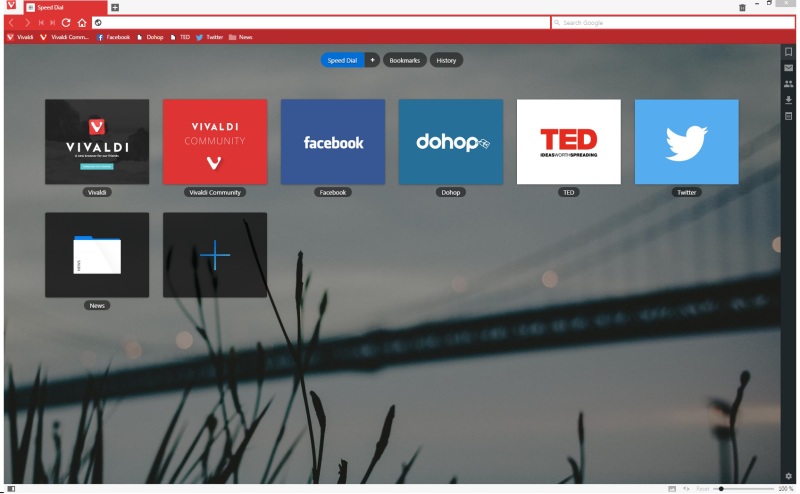
The address bar is simple, with a little customizable Google Search bar to the right and the navigation buttons on the left, as on any other browser. The layout and user interface have obviously taken notes from Material Design a bit, but not in a way that you would think it was completely inspired by Google’s new design language. The menu key will get you addition functions that you can use, while you get another panel on whichever side of the browser you want, which will give you quick access to settings, mail (soon), contacts, downloads and notes that you can make. Even though Vivaldi is still very experimental, it offers a surprisingly clean, smooth experience, which to me is amazing.
Being at the second technical preview, Vivaldi still has a long way to go and there are many improvements to be made to the user interface, shortcuts, keyboard shortcuts, menu items and the overall layout. In spite of that, Vivaldi is still a very impressive piece of software and I’m definitely seeing it make a run for the money against Google Chrome, Opera and Mozilla Firefox. The main focus behind the browser is to create a comprehensive application that doesn’t need add-ons to make the experience as complete and helpful to the user as other browser do. Having too many add-ons will slow down the browser, and will inevitably compromise security and user interaction.
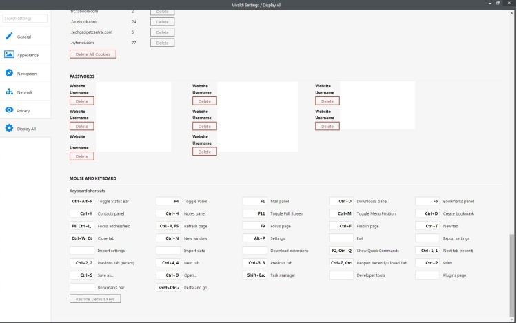
Vivaldi’s strongest point at the moment is not customizability, but keyboard shortcuts. You can bring up the bookmarks panel, mail, contacts, downloads, quick history search, feature search and quick commands panel by the press of a button, if you want to. All the shortcuts are customizable, which is absolutely great. I love keyboard shortcuts and I miss the good old days when I used Winamp for music and had fun with all the shortcuts. That’s not the best example I could give, but it reflects the nostalgic feeling I have towards keyboard shortcuts. One of the neatest features are, against all odds, fast forward and rewind buttons. If you’re confused, don’t fret, I was just as confused until I played around with them a little. With Rewind, you get back to first page you browsed on a domain. For instance, if you clicked this article and got to Tech Gadget Central, but browsed around on the site, the Rewind button will take you back to this article. The same works for the fast forward, taking you back to the last site you checked out on a domain.
Vivaldi CEO Jon S. von Tetzchner, former Opera CEO, is behind all of these features and has come clean to Ars Technica in the article we mentioned above that features like sync and extensions are in the works and will be coming soon to the browser. Overall, first impressions of this browser: impressive. Even though it’s obviously unfinished, I can see myself switching to this instantly, without a second thought, and I think I’ve just done that. I don’t use many extensions, save for AdBlock Plus and a few tools of my own, so I can get by without them in certain days. I will still keep Chrome as a back-up, because you do get the occasional fail with Vivaldi, too. In any case, I’m looking forward to a stable, final, worked out release of Vivaldi and the team behind the app has all my support. Good job and keep going!
 Tech Gadget Central Latest Tech News and Reviews
