The first unofficial day of the MWC 2015 kicked off with the Acer event, after which Huawei, HTC and Samsung came with their own shows. Acer didn’t bring Windows 10 phones, just phones that will be upgraded to Windows 10 once the software is out. Huawei, on the other hand, managed to attract a lot of limelight and attention at the MWC 2015 this year. The Chinese company launched a new smart watch, the Huawei Watch, two fitness trackers, the TalkBand B2 and TalkBand N1 and a massive phablet/tablet hybrid, the MediaPad X2. HTC came along, with the new flagship that was shaping up to be the star of the MWC 2015, the HTC One M9. But the One M9 didn’t impress as much, and neither did the company’s fitness tracker, the HTC Grip, developed in conjunction with Under Armour. The most impressive gadget HTC demonstrated was the HTC Vive, its own virtual reality headset built in collaboration with gaming studio Valve. The HTC Vive is the most impressive VR headset I’ve seen, and it will actually let you walk around and explore the virtual environment you are experiencing, for a completely immersive experience. Samsung was last on the first day of MWC 2015, and the company just launched the Galaxy S6 and the Galaxy S6 Edge.
MWC 2015 day 1 was shaping up to be massive since last week, as thousands of rumors regarding the biggest launches of the year were piling up. Fans and tech enthusiasts were getting more and more excited each day, hoping for the best from all the companies that were hosting shows today. Alas, most of them actually disappointed, according to users, attendees and those who watched the live streams of each event. How can that be? I’m wondering the same. HTC and Samsung both brought novelty to the show, but they didn’t really bring anything that would make one go: wow. Consequently, the HTC One M9 turned out to be exactly what we thought it would: an upgraded HTC One M8, with the same design language, improved only by a dual-tone metal finish in gold and silver and by upgraded BoomSound and Harmon/Kardon speakers. The Galaxy S6 turned out to be an improved Galaxy S5, with certain shortcomings and a few software improvements. The Galaxy S6 Edge is a smaller version of the Note Edge and a bulkier version of the Galaxy S6. Otherwise, the devices keep the Samsung design language, with a few twists.
HTC One M9
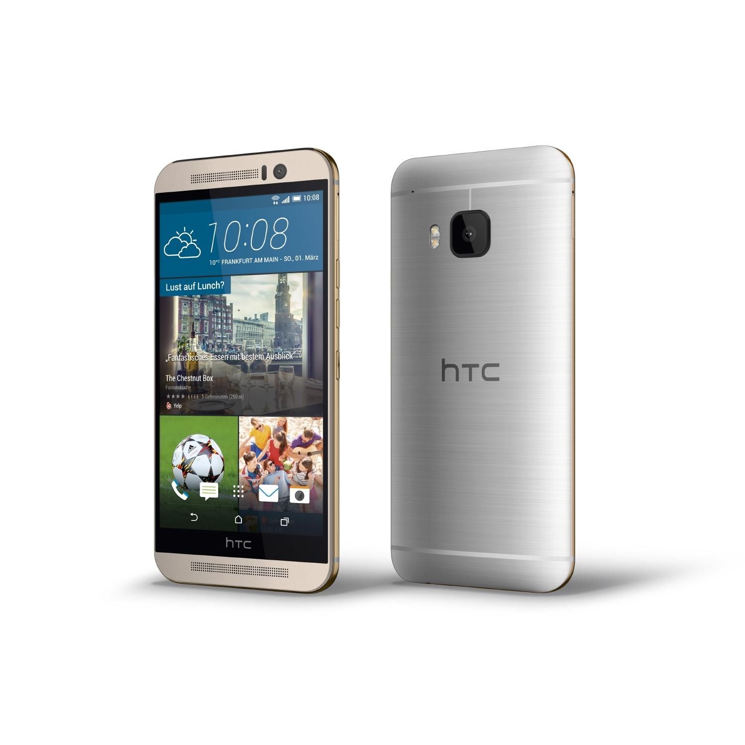
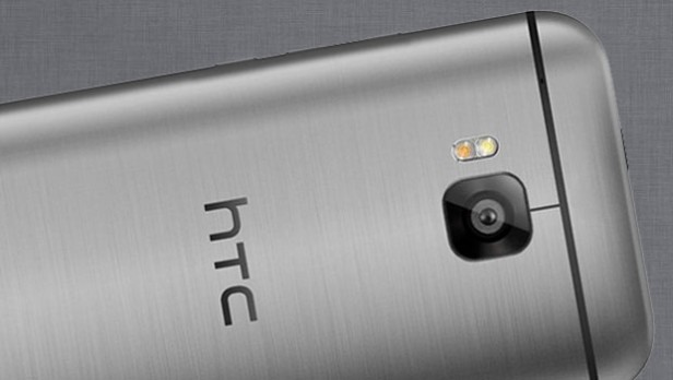
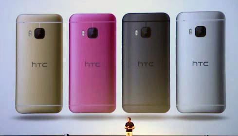
Let’s talk about the HTC One M9 first, as everybody at the MWC 2015 was most excited about this launch. Many were hoping that the videos about the device that were leaked earlier this week were fake, as many would have rather liked a new design from the Taiwanese company. Alas, they were real, so nobody was surprised by what the HTC One M9 turned out to be. If you haven’t been in the loop or have missed the livestream, let me quickly go through the specs of the One M9. First off, the device gets a metal unibody, as seen on the One M8, with non-removable battery, microSD card slot, thick bezels and BoomSound speakers. The internals of the phone are greatly improved compared to its predecessor, so that’s definitely good news. If HTC prices this right, it will be just as much a hit as the One M8 was. The new HTC flagship gets the Snapdragon 810 CPU under the hood, backed by 3 GB RAM and 32 GB internal storage. The camera setup is also greatly improved, as the HTC One M9 is equipped with a 20 MP sensor on the rear and an Ultrapixel sensor on the front. The battery pack measures 2840 mAh. You might be worried about that, but you don’t need. The phone comes with a 5 inch display that has the same FHD resolution as its predecessor, and we’re glad about that, because it means improved battery life.
https://www.youtube.com/watch?v=BWhM_oHr558
Now with those specs listed, let’s see what’s good and bad about the new HTC One M9. Even though MWC 2015 attendees were pretty skeptical about the new handset at first, it seems many are in fact quite delighted with what HTC has done with the new flagship. The one downside of the HTC One M9 is that it doesn’t really up the game when it comes to smartphone design, as it keeps the design elements of the One M7 and One M8. The full metal unibody looks just as classy, but with the added gold trip on the sides, it actually looks quite appealing. HTC’s philosophy behind the repetitive design is that feedback generated it. Everybody loved the One M8, which has one quite a few prizes for its design, so it seemed natural to the company to try and reproduce that prize-winning design. It’s not a bad idea, as we’ve seen Samsung recycle the same old design for years now, successfully. Why shouldn’t HTC do the same with the HTC One M9?
Besides the design elements, the HTC One M9 will still impress with its specs and improved features. First off, Android 5.0 Lollipop with Sense 7.0 seems like a great bargain, even though we didn’t get the near-vanilla experience many were hoping for. Sense 7.0 is said to be greatly improved over Sense 7.0, with a new theme feature that lets you customize your phone’s layout. Since style seems to be the main drive behind the One M9, the chassis is brought down in size a bit, although not a considerable amount to be fair. Still, it seems a bit more manageable thanks to the different button placement. The company decided to bring the buttons down lower on the sides of the phones, so that they would be easier to reach. A good call, in my opinion.
The fact that HTC kept the 5 inch 1080p display form the One M8 seems to sit well with HTC fans, as it will definitely make for great battery life, combined with the upgraded Qualcomm Snapdragon 810 CPU. If you think there won’t be any difference between the HTC One M9 and One M8 display, you’re wrong. The new phone has a much brighter, higher-end display overall, which translates to great viewing angles and outdoor visibility. Even though the One M8 sat pretty well with its own display, the One M9 is even better, so props go out to HTC for managing to keep the phone maneuverable, easy to use, stylish and premium, without upping the game as much as to slap a massive price tag onto it. For one, the HTC One M9 will definitely be cheaper than the Galaxy S6 and the Galaxy S6 Edge this time around, and we’re glad about that. It’s a much better approach towards a market that is less and less appreciative of buying on contract and doesn’t really have the dough to spend close to $1000 each year on a new phone.
One admirable change HTC made to the new flagship was upping the camera. The 4 MP Ultrapixel camera from the One M8 hasn’t been completely discarded, as it was moved to the front, which means you’re going to get awesome wide-angle selfies out of it. The rear gets that massive 20 MP camera which is absolutely great to use, save for video at the moment. At the MWC 2015, prototypes were put to test, which means that the way they behaved doesn’t necessarily reflect what the end user will be getting. The autofocus issues we’ve noticed when shooting 4K video with the HTC One M9 camera were quite annoying, but we’re more than sure that HTC will address that and have it fixed by the time the phone hits shelves. The camera otherwise is snappy and will definitely appeal to HTC fans who were disappointed in the One M8 camera last year.
One thing that we should mention is the BoomSound front-facing speaker setup which comes with Harmon/Kardon audio. They are extremely high-def and have great bass, something that is hard to find on smartphone speakers. Even though some users have voiced their opinion negatively about having strong speakers on a phone, saying that people don’t even use them, there is a considerable amount of praise towards the new BoomSound speakers on the One M9. The speakers are probably the best smartphone speakers at the MWC 2015 and most likely, on the market. They are crispy clear and even with video recording, they produce amazing audio playback. I was truly pleased with the results and was actually looking forward to the upgraded BoomSound speakers. How about you? Do you use the phone speakers? I use them when I exercise or when I shower or when I cook. Lame, right? At least I get awesome bass.
The Snapdragon 810 64 bit quad core chipset is coupled with 3 GB RAM, which means uber-fast response and processing power which will also perform well in the battery management department. We’re curious to see how it does compared to the Exynos processor in the Galaxy S6. From quick benchmarks performed at the MWC 2015, we’re getting the same performance as on the LG G Flex 2, the first phone to use the new Qualcomm chipset. The battery maxes out at 2840 mAh, and even though we expected more mAh on the One M9, I think it will hold out pretty well with the FHD display and super-fast processor. You definitely get fast-charging, which is more of a given with newer generation smartphones. Overall, even though it seems repetitive, the HTC One M9 so far offers top-notch performance and features and we’ll have more about Sense 7.0, battery life, display behavior and BoomSound speakers later on.
Galaxy S6 and Galaxy S6 Edge
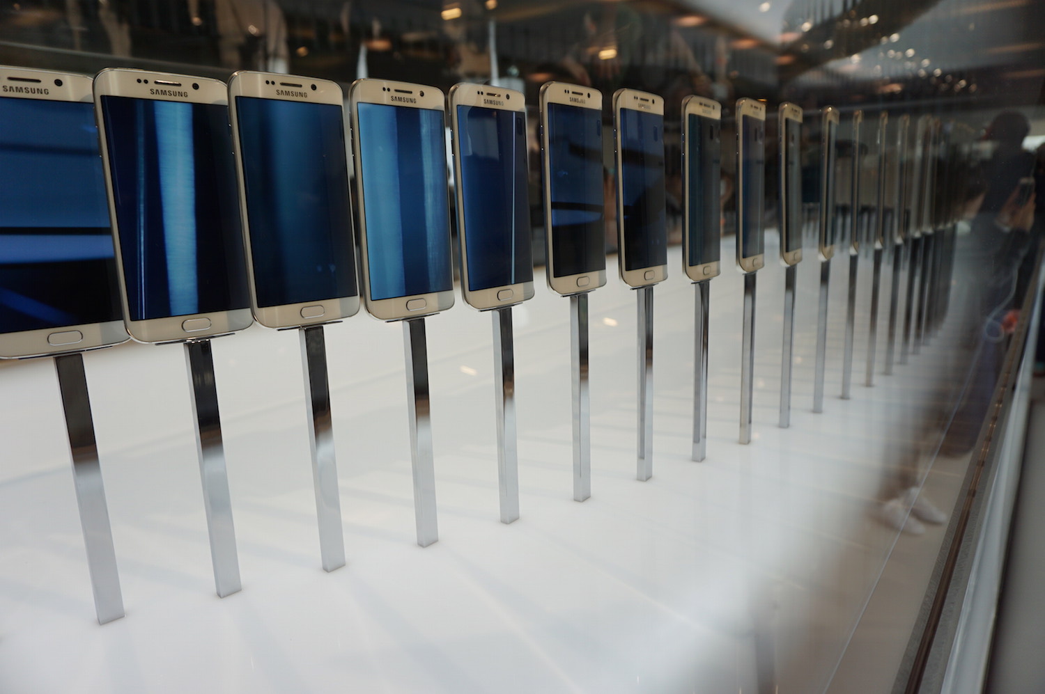
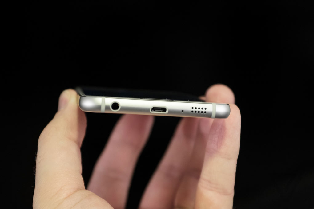
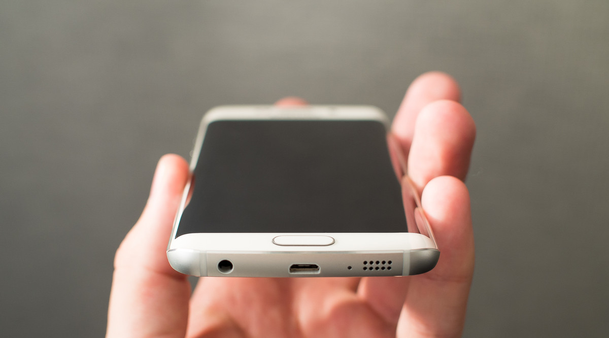
Moving on to the Galaxy S6, and the Galaxy S6 Edge, because they’re basically the same, many will be disappointed by the design, first off. Even though we were promised Project Zero, a complete design overhaul, we only got just a slight re-interpretation of the Samsung design language. Now, you can clearly notice differences between previous design Galaxy phones and the Galaxy S6,but not as much as to warrant the wow-effect we’ve been hoping for. Nonetheless, once you get to hold the Galaxy S6 Edge, particularly, in your hand, you’ll immediately notice the difference. We’ve got metal bodies, which feel sturdier than the Galaxy S5 or even the Note 4, lined with real metal frames. There are two elements to each of these new Samsung flagships that are particularly disturbing to some fans: the back panel and the bottom of the phones. Now, if you’re familiar with the Sony Xperia Z3, you’ll see that familiar glass panel on the back panel of both the Galaxy S6 and Galaxy S6 Edge. It looks glossy and it’s a fingerprint magnet, just like on the Xperia Z3, which is not really a sought-after feature in modern flagships, as once you use for an hour, it’ll look dirty and blemished. Still, both handsets feature Gorilla Glass 4 on both sides, which means they’re rather sturdy and durable. It’s a matter of preference really, but if I do say so myself, I’m not a fan of glass panels on the back of any phone, which is one of the reasons why I was never attracted to newer Xperia devices. Setting that aside and moving on to the bottom of the Galaxy S6, yet another familiar image pops into my head: the iPhone 6 and iPhone 6 Plus. Indeed, the bottom of the new Galaxy phone looks very much like the bottom of Apple’s new smartphones, with chamfered edges, speaker holes and the microUSB port. It’s rather unsettling, as if you look at it from the bottom, it’s easy to confuse the Apple flagship with the Samsung one.
Design aside, the Galaxy S6 and the Galaxy S6 Edge are so far among the best phones launched at the MWC 2015. But we can’t draw any conclusions on performance just yet, because we haven’t had time to test out the phones. But we will and will get back to you on that. As suspected, both the Galaxy S6 and S6 Edge have dropped Qualcomm’s Snapdragon 810 CPU, and opted instead for the in-house Exynos 64 bit octa-core chipset, which showed promising results in leaked benchmarks before the phones were actually launched. We will have to see if the real deal lives up to those impressive benchmark results. The CPU is backed up by 3 GB RAM and you will be able to choose between a 32, 64 and even 128 GB internal storage option once these phones hit shelves on April 10. Sadly, pricing information hasn’t been disclosed as of yet, but we’re expecting numbers above $800. If that is the case, many will have to opt for contracts with various carriers, as more than $800 is a lot to pay for a smartphone this day and age. Especially since you’ve got great devices from OnePlus coming up (OnePlus Two, anyone?).
Moving on to display, this is where the Galaxy S6 and S6 Edge are a bit different and the reason why the S6 Edge is going to be one of the stars of the MWC 2015 show: the dual-edge, curved display. We’ve seen the tech in use in the Galaxy Note Edge, but Samsung has spun their original take on the curved design a bit. On the Galaxy S6 Edge, we’ve got curves on both sides, but they are slightly narrower than on the Galaxy Note Edge and they actually look and feel quite appealing. They don’t have as many functions as on the Note Edge, but they do light up colorfully based on presets when calls or notifications come and they are really ambiental in this respect. That’s one aspect I really like about the Galaxy S6 Edge, but otherwise, the edge displays can be used for much of the same things as on the Galaxy Note Edge. You can bring up contacts and use the side to display the clock or scrolling stock, sport, weather and other information you might need. Overall, it’s not a very helpful feature, but it sure looks awesome when siting face down on a table.
When it comes to the display quality, we expected top-notch, and we got that part right. Both the Galaxy S6 and the Galaxy S6 Edge have 5.1 inch Super AMOLED panels with QHD resolution (1440*2560) that add up to over 550 ppi pixel density, which is well above what we can perceive with the naked eye. The display is super-bright and high quality, but we are wondering how much battery it will use, seeing as the battery unit in both these flagships are rather small. Whichever the case may be, the display looks awesome and it’s probably the best smartphone display at the MWC 2015 and possibly on the market. It looks even better than on the Note 4 and Note Edge, FYI. The Galaxy S6 Edge has just a few added pixels on the side and a more elongated shape, which personally I think will sit well with many users. Anyhow, the Galaxy S6 Edge looks rather fantastic and non-conventional so it will definitely draw crowds, if priced right. My hunch is that Samsung will ask a considerable premium… for the premium.
Now let’s sum up the other features in these phones. If you were expecting a toned-down TouchWiz, you got it, but probably not as much as you had expected. The UI has been simplified and some icons have been turned into text for easier use, but overall, TouchWiz is still TouchWiz and leaves little room for the underlying Android 5.0 Lollipop Material Design influences. You do get the occasional glimpse of Material Design, but TouchWiz is overwhelming. Regardless, it actually moves faster than it does on previous Samsung flagships, so that’s a pro of the new devices’ software. We will have to put that to the test once we get our hands on a review unit and we’ll get back to you on that and more. We’re more worried about the battery within the phones, though, as they’ve been brought down compared to the Galaxy S5. The battery in the Galaxy S6 Edge is slightly smaller than it is in its more conventional counterpart. The Galaxy S6 gets a 2550 mAh battery, which is smaller than the Galaxy S5’s 2800 mAh battery by a bit. The Galaxy S6 Edge gets just a bit more battery capacity at 2600 mAh. That’s not a lot for a massive QHD phone with edge displays added.
One of the big disappointments at the MWC 2015 was that neither the Galaxy S6 or the Galaxy S6 Edge come with removable batteries or microSD card slots. Those were among the favorite features of Samsung fans, but the South Korean company decided to drop the, anyway. Samsung says they’ve bypassed these things with new additions, but many don’t think so. The new flagships come with wireless charging and very fast charging (10 minutes of charging equals 4 hours of battery time), but that still means that you’re going to have to carry a charging pad with you at all times, as our hunch is that QHD screen will drain the battery like crazy and the Exynos processor probably won’t help with that very much. Moreover, the Galaxy S6 and S6 Edge will be available in larger storage options, but the company will most likely choose to price the extra storage at a considerable premium of about $100 per upgrade, which will definitely bring the price up a lot. Not very nice, Samsung. But you do get a pretty neat 16 MP camera on the rear equipped with optical image stabilization, which is supposedly very response as it can launch in under a second with a shortcut while the phone is idle. That would be impressive. The front camera is a 5 MP wide-angle camera, which is just as good, although I’m not a selfie-fan. Unless I don’t have a mirror handy and feel some parsley between my teeth. Gross, I know.
As the two (three) huge flagships of the MWC 2015 have attracted a lot of limelight, we were wondering if the other devices launched by the two headlines would attract the same amount of interest. Excuse me, Samsung didn’t launch anything else, but it launch the uninspired Samsung Pay payment platform. This mobile payment thing is getting old, fragmented and will end up being too fragmented to be implemented by retailers and companies. Just my two cents. Google Wallet is getting a revival, too, so this is going to be a funny battle. I vote neither. Cash only, why leave a payment trace? No, I’m not on the run from the law, I just don’t like being monitored, tracked, surveyed and whatever. Hell, I don’t even use banks, save for international stuff which I can’t handle personally. But enough of about me, I was saying that Samsung didn’t launch anything else, whereas HTC has launched quite an impressive new portfolio.
HTC Grip
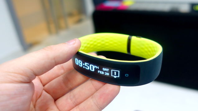
The HTC Grip is the first sprout of the Under Armour partnership, and it looks like a pretty neat little fitness tracker. Even though we were expecting PETRA, a smart watch, a fitness tracker seems like a more sensible option if you think about. People want fitness trackers and there’s quite a massive niche for these kinds of devices. Even I feel tempted to get a fitness tracker because I think it will motivate me, even though I know I’m going to stay the same old lazy-ass as until now. I did improve my nutrition, and I got a treadmill and started doing some yoga, but luckily, I’m still fit after spending 14 hours a day at a desk. Really need to get my hands on those neat standing desks. Sorry for the rambling, the HTC Grip is at fault.
Wearables will be a big thing at the MWC 2015 this year, as Huawei came out with the Huawei Watch, the TalkBand B2, Talkband B1, LG showed off the LG Watch Urbane and Watch Urbane LTE and the Apple Watch is also coming up on the 9th of March. Why would HTC stay out of the ripple? The HTC Grip is not much more than an average fitness tracker, so it doesn’t get a lot of extra features, but it still seems like a neat little device. Since this is the Taiwanese company’s first foray into the wearable market, it’s actually pretty impressive, I do say so myself. I like the neon green color, minimalist design and easy to use interface, which I suspect will sit well with many fitness enthusiasts.
The HTC Grip gets the same notification delivery capabilities as most other smart bands out there. as well as all the fitness tracking you could ever want. The Grip gets a curved P-OLED monochrome display with a rather low resolution, but since it’s purpose is fitness tracking, we don’t mind. We can’t tell you much about the device, though, as it’s still in development, to be launched later this year. It’s pretty impressive at first, but it’s not perfect. It’s currently much to sensitive to touch input, making it hard to use and you can’t pair it with a smartphone just yet. But these will hopefully be mended by the time it’s finished.
HTC Vive
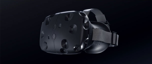
The more interesting thing HTC brought to the MWC 2015 show yesterday was the HTC Vive, developed within a Valve partnership. The Valve partnership ended up creating one of the most interesting VR devices I have seen so far. The Vive brings virtual reality to another level, as it comes with more than 70 sensor that can track you and your environment in a 360 degree angle. It’s truly a promising virtual reality headset, much more so than the Gear VR or even Oculus Rift. You can actually put the goggles on, no extra $800 smartphone investment needed, and walk through virtual reality. Moreover, HTC promised at the unveiling event at the MWC 2015 that the consumer version will be ready and in stores by the end of the year. That’s plain rad. We haven’t tested the HTC Vive, but we sure as hell hope to get the kit soon enough, as the SDK is out already. Remember when I said Samsung didn’t launch anything apart from the Galaxy S6 and Galaxy S6 Edge? I just remembered that they did: Gear VR for the Galaxy S6. How cool, another VR headset that will probably cost more than the original designed for the Note 4, and will need the new Galaxy S6 in order to work. That’s more than, and I’m guessing here, $1000 invested in a system that doesn’t even come close to the Oculus Rift or even the HTC Vive. Google Cardboard can do what the Gear VR can, under $100. Sorry for being so critical, but I’m not fond of companies that overprice their stuff and make them exclusive, asking more and more money in order to make them worthwhile. That applies to why I’m not fond of Apple either. But hey, I love open source. And Valve.
So there you have it folks! Aside from the Acer and Huawei shows, you’ve got everything you need to know about the first day of the MWC 2015 show, in a long-ass, critical, biased post. I’m going to go ahead and say what some might have commented: biased, opinionated. Still, I feel I’ve delivered the facts our readers were looking for in great detail, and that’s what really matters. And I want to stress the fact that I’m not really biased or opinionated that much, even though I sound like it. Market analysis and product management courses have had a bit of influence on me, so that’s where the criticism comes from. Let me know what you think about each of these new devices and tell me which would you like to buy if you had one choice? Also, feel free to ask me to review any other gadgets that will be launched at the MWC 2015, although I will try to bring you the scoop on each and every one of them this week.
 Tech Gadget Central Latest Tech News and Reviews

